Selected Projects / Building a scalable Design System
Building a scalable Design System
ROLE
Product Design Lead
TIMELINE
Apr 2021 – Oct 2023
CONTRIBUTIONS
Strategy, Leadership, Design System
OUTCOME
A scalable, robust design system driving consistency and team efficiency
Summary
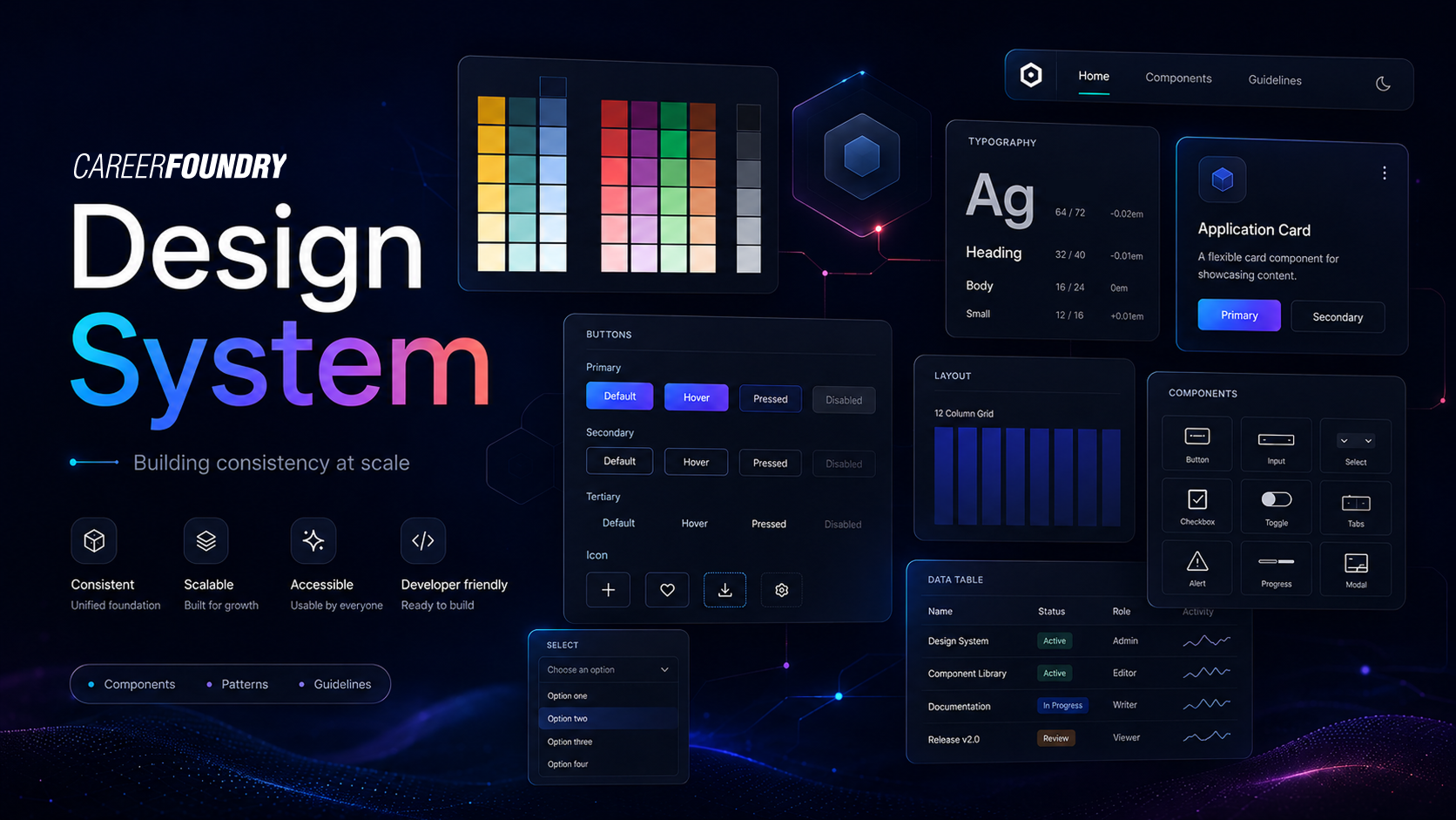
I led the creation of a company-wide design system for a 120+ person organization, balancing consistency and scalability with creative flexibility. I drove the initiative from leadership pitch to strategy, processes, and implementation planning.
PROJECT OVERVIEW
A single source of truth for design across the company
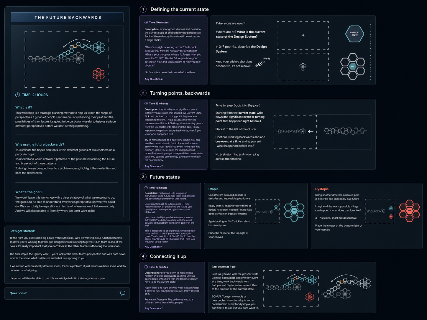
We kicked off the project with a future-backwards workshop, bringing together stakeholders from marketing, product, and engineering. Together, we reflected on past work, aligned on our ambitions for the design system, explored potential opportunities and risks, and defined the project’s key purpose and objectives.
Purpose
Our primary goal was to create a single source of truth for all design elements across the company, aligning with industry best practices that emphasize consistency, reusability, and efficient scaling. According to Nielsen Norman Group, a well-structured design system reduces design debt and enhances cross-functional collaboration by providing a unified visual language across products and teams.
Objectives
- Establish a cohesive design language that aligns with our brand and user experience goals.
- Create reusable components and guidelines that improve productivity and reduce redundant design work.
- Foster cross-functional collaboration to ensure the design system meets both technical and creative needs.
Team structure
The project was led by our design team (team of 5), collaborating closely with front-end developers (3 main contributors) and product managers (2 main contributors). We also followed industry recommendations from experts like Brad Frost, who advocates for involving stakeholders from the start to build a design system that genuinely serves the needs of both designers and developers. Stakeholders from various departments were engaged periodically to gather feedback and ensure alignment with company-wide objectives.
ROADMAP & TIMELINE
A three-phase, 12-month rollout
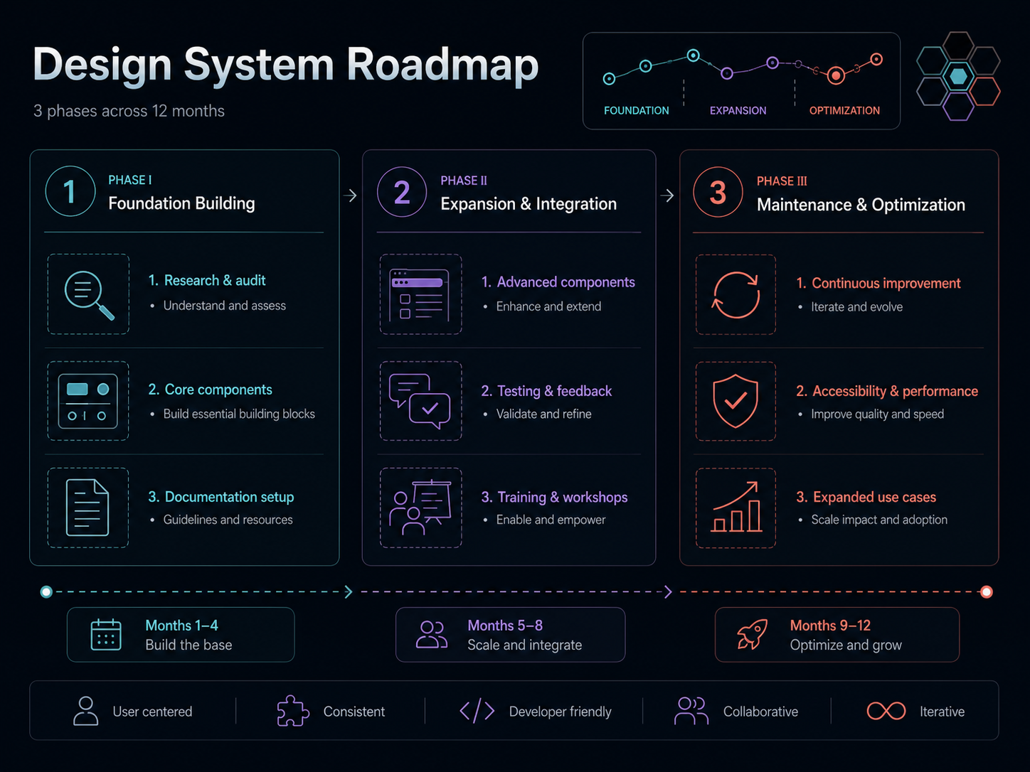
Our design system roadmap was structured in three main phases (lasting 12 months), in line with industry recommendations for gradual implementation and iterative improvement.
Phase I: Foundation Building
- Research and audit: Conducted a comprehensive audit of existing designs and assets. We referenced Atlassian's Design System Guidelines for setting up an audit process that includes gathering feedback from all departments.
- Component library: Developed initial components like buttons, inputs, and typography, prioritizing core elements.
- Documentation drafting: Began documenting usage guidelines and setting up a central repository, a step recommended by Material Design's Guide to ensure ease of access and adoption.
Phase II: Expansion and Integration
- Advanced components: Created more complex UI elements (e.g., navigation bars, modals) and ensured alignment with front-end standards.
- Testing and feedback: Regularly tested components in real scenarios and collected feedback from designers and developers. Following Google's Material Design methodology, we integrated feedback loops to identify usability improvements.
- Training and workshops: To ensure our design team had the expertise needed to work effectively on the design system, I secured a training budget, allowing all designers to take the Learn Design Systems course by Dan Mall. Additionally, I advocated for the development team and product managers to take relevant courses and attend design system events alongside the designers, fostering a shared understanding and common language across teams.
Phase III: Maintenance and Optimization
- Continuous improvement: Established a process for ongoing feedback and iteration, ensuring we stayed aligned with evolving company needs.
- Performance optimization: Focused on refining components for performance and accessibility, following WCAG (Web Content Accessibility Guidelines) to meet industry standards in accessibility.
- Expansion of use cases: Identified new areas within the company where the design system could add value, informed by insights from IBM's Carbon Design System, which emphasizes scalability.
KEY COMPONENTS
The building blocks of the system
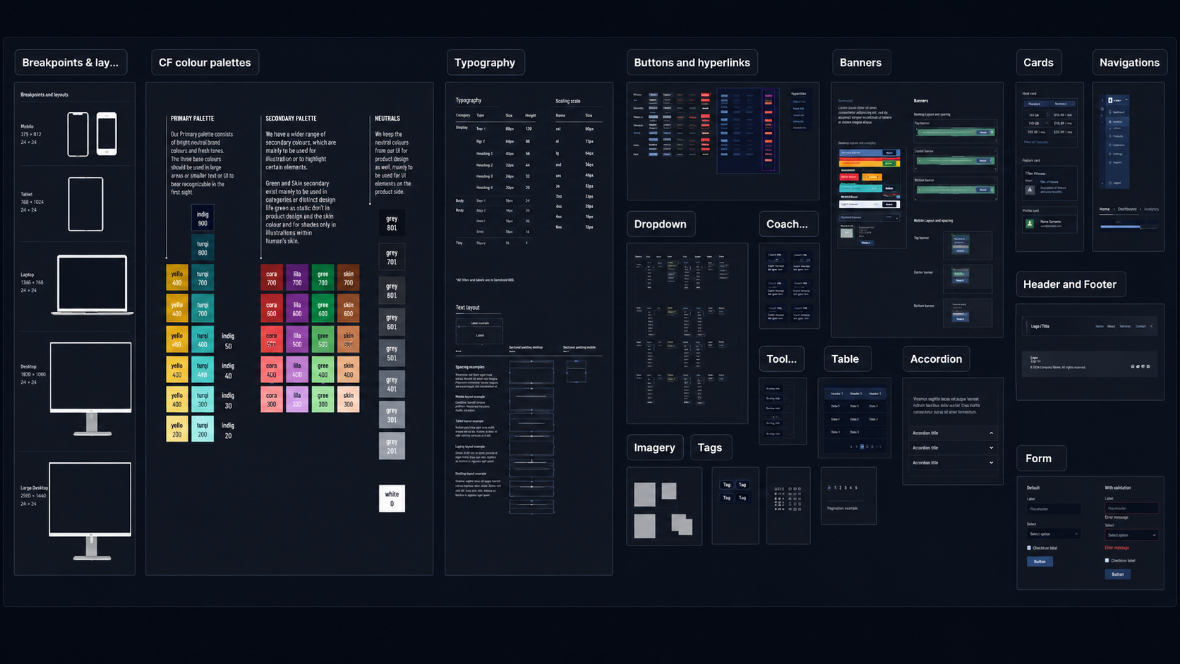
The core components we developed include:
- Typography: Standardized fonts, sizes, and weights to maintain brand consistency, following Apple's Human Interface Guidelines to ensure readability and accessibility.
- Color palette: Created a cohesive color palette with primary, secondary, and neutral tones, referencing Google's Material Design Color System to achieve harmony and contrast.
- Buttons and inputs: Designed buttons with different states (hover, active, disabled) and standardized form inputs, ensuring consistent interaction patterns across the platform.
- Icons and imagery: Built a library of icons and guidelines for using images effectively within the design framework, referencing Font Awesome's Best Practices for iconography.
- Complex components: Developed navigation bars, modals, and cards, ensuring they were adaptable for various use cases and optimized for mobile and desktop following Bootstrap's Responsive Design Standards.
Each component was carefully documented with guidelines on usage, spacing, and accessibility considerations, aligned with expert recommendations on creating a thorough and accessible design system.
DEVELOPMENT PROCESS
Embedding the system into everyday product work
Given our company's size and resources, we couldn't afford to have a dedicated product team solely focused on the design system. Instead, I created a streamlined development and update process that allowed each product team to contribute to the design system gradually as part of their existing workflows.
Integrating design system tasks into product development
To make design system contributions a natural part of daily work, I persuaded leadership to approve a process where design system tasks would be incorporated into feature development sprints. For example, if a team was building a new AI tutor chatbot feature, the relevant components for the chatbot would be added to the design system during that sprint. This "develop-on-the-go" approach allowed us to break down the extensive design system work into manageable, achievable tasks, distributed across teams.
Collaborative design workshops
To ensure consistency across teams, I set up bi-weekly meetings for designers to workshop together on defining new components. Since each designer is embedded within a different cross-functional product team, these sessions allowed us to share insights, assumptions, and use cases for components from each team. Through this collaborative process, we ensured that new components were versatile enough to work across all product teams and platforms. For components unique to a single platform, the responsible designer had the final say in defining them.
Structured onboarding and documentation
To maintain alignment and avoid redundant work, I established a clear onboarding process for product team members and created thorough documentation. Each team was guided on the process for contributing to the design system, and we provided a communication channel to keep everyone informed of updates and changes. Design system tasks are managed on a dedicated Jira board linked to each product team's individual boards, enabling transparent tracking and coordination across teams.
This structured approach not only ensures consistent progress but also allows our design system to evolve organically with the needs of our products, embedding it deeply into the company's development culture.
COLLABORATION & FEEDBACK
Feedback loops across every team
To ensure that the design system met the needs of all stakeholders, we set up regular feedback loops and collaboration points for cross-functional engagement:
- Weekly check-ins: Designers and developers met weekly to discuss any issues or improvements needed.
- Feedback sessions: Collected input from product managers and engineers who regularly interacted with the design system.
- Cross-department workshops: Held workshops to introduce new components and gather feedback on usability and functionality.
These feedback mechanisms, consistent with IDEO's Collaborative Design Principles, were instrumental in refining the system and ensuring its relevance across different teams.
MEASURING SUCCESS
Proving the value of the system
To track the effectiveness and health of the design system, we established a series of success metrics inspired by industry standards like Design Maturity Models from McKinsey. These metrics provided concrete ways to measure the design system's impact on efficiency and quality, enabling us to demonstrate value to stakeholders.
Time saved in product sprints
We used Jira's Velocity Chart to measure the team's pace of task completion across sprints. Velocity represents the story points completed within each sprint and helps us quantify how the design system improves productivity.
- Baseline measurement: Before implementing the design system, we tracked the average story points completed per sprint over several cycles. This baseline served as a benchmark for comparison.
- Post-design system implementation: Following the rollout, we measured an increase in the story points completed per sprint, reflecting faster workflows due to reusable components and standardized practices.
By comparing pre- and post-implementation velocity, we saw a 35% increase in story points completed, indicating significant time savings from the design system.
Reduction in bug rates
Our company uses a dedicated board for tracking bugs, with a specific section for UI/UX-related bugs. This segmentation allowed us to monitor the number of design-related bugs reported per sprint and measure the design system's effectiveness in reducing design inconsistencies. Regular monitoring of the UI/UX section in our bug board provided clear visibility into trends and helped identify specific areas where the design system was most impactful in reducing errors.
Component detachment rate
We tracked the percentage of detached or overridden components in design files to ensure components were correctly defined and utilized. A low detachment rate of under 10% indicated that components were generally well-defined and fit their intended purposes across different teams. Any component with a detachment rate above this threshold was flagged for review and improvement.
Adoption rates across teams
Another indicator of success was the level of adoption across different teams. With over 90% adoption of the design system's core components, we ensured that our system was effectively supporting cross-functional workflows and product needs.
Qualitative feedback from stakeholders
We also collected feedback from designers, developers, and product managers. Positive feedback highlighted improved workflow efficiency and ease of collaboration, with team members reporting smoother cross-department handoffs and reduced need for redesigns.
Ongoing health metrics
- Component usage frequency: Measuring how often each component is used helped identify high-value components versus those that might need adjustment or removal.
- System updates and maintenance: We tracked the number of updates and maintenance tasks completed to ensure the design system stayed current and aligned with evolving product needs.
- Consistency in implementation: Monitoring consistency across different product teams helped ensure adherence to the design system, with additional guidance or training provided as needed.
These metrics helped demonstrate the tangible value of the design system to stakeholders and provided clear measures of the project's success. By tracking both quantitative and qualitative results, we ensured that the system met its intended goals and continued to evolve in alignment with company growth.
REFLECTIONS
Challenges and Lessons Learned
Challenges faced
One of the most significant challenges in building the design system was persuading stakeholders to buy into the project. Initially, I presented the plan to the leadership team, emphasizing that a robust design system would improve brand consistency, create a seamless user experience, and accelerate product development. I proposed success metrics to measure its impact, such as the percentage of time saved in product sprints to launch a feature and the percentage of decreased bug rates due to design consistency.
Once we successfully gained leadership support, our next focus was on bringing other essential contributors — developers, product owners, and marketing experts — on board and excited to contribute. To build momentum and foster a sense of ownership, together with design team members, we organized design system ideation workshops where these teams could contribute their thoughts and experiences. Additionally, I worked with department leaders to appoint advocates from each area as representatives who would regularly contribute to and monitor the progress of the design system.
To maintain consistent progress, I set up regular meetings with these representatives and collaborated closely with a passionate product designer who helped manage the project. This structured approach allowed us to systematically move the project forward, steadily building a cohesive and effective design system that aligned with our goals.
Lessons learned
- Start small and build gradually: Focusing initially on high-impact components helped quickly demonstrate the design system's value, making it easier to gain buy-in.
- Involve stakeholders early: Bringing in cross-functional teams early and designating advocates from each department created a coalition of supporters who felt a sense of ownership and accountability.
- Document thoroughly: Clear, accessible documentation minimized friction and made the design system easier for everyone to adopt and understand.
Disciplines
- STRATEGY
- LEADERSHIP
- DESIGN SYSTEM
Next project
Student Onboarding →