Selected Projects / Inu Health
Inu Health
Designing a supportive digital health experience for people managing endometriosis
ROLE
Lead Product Designer & Illustrator
TIMELINE
Aug 2020 - March 2021
CONTRIBUTIONS
Research · Product Strategy · UX/UI · Brand & Illustration
OUTCOME
A well defined product brand identity, MVP product IOS
Summary
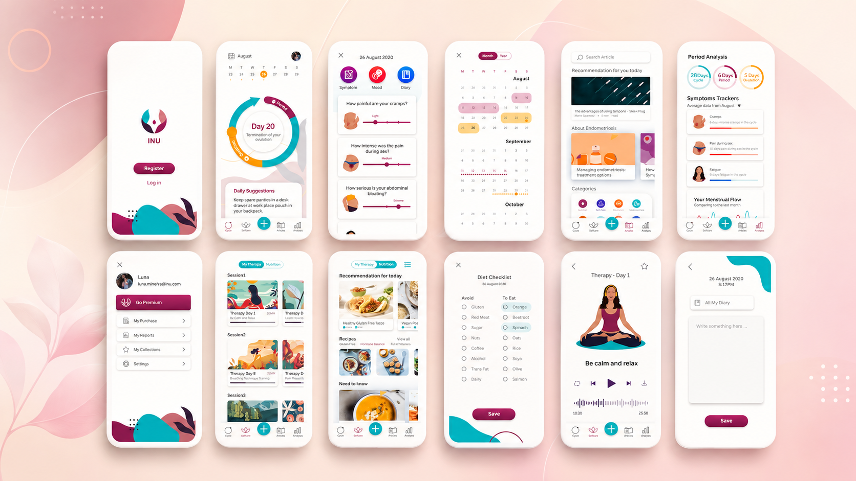
Inu Health is a digital health concept combining symptom tracking, personalised guidance, nutrition support, and cognitive behavioural therapy content to help people better understand and manage endometriosis symptoms.
PROJECT OVERVIEW
The challenge
Endometriosis can be difficult to recognise because many symptoms overlap with experiences that are commonly normalised as part of menstruation. Through early conversations with potential users, we also found that existing digital products did not adequately support endometriosis-specific symptom tracking or provide actionable day-to-day guidance.
The product needed to solve three connected problems:
- Help users recognise patterns — make it easier to record symptoms consistently and understand how they change over time.
- Turn data into meaningful guidance — avoid presenting users with raw tracking data without explaining what it could mean or what they could do next.
- Provide support without creating anxiety — create an experience that feels credible and reassuring while remaining clear that it does not replace professional medical care.
How might we help people living with recurring endometriosis symptoms feel more informed, supported, and in control of their daily health?
Product scope
- Period and symptom tracking
- Digital CBT-based therapy
- Personalised symptom insights
- Endometriosis-focused nutrition guidance
- Educational health content
My contribution
As the sole designer, I joined the early-stage team (in Vision Health Pioneer Incubator) and partnered directly with three founders to turn an initial idea into a tangible product direction. I was responsible for both establishing the product brand identity and creating the product design foundations the team needed to continue developing it.
- Planned and facilitated user interviews and focus-group discussions
- Synthesised qualitative insights into product opportunities
- Defined personas, scenarios, journeys, and core user flows
- Worked with the founders to prioritise the MVP
- Designed wireframes and interactive prototypes
- Established the product’s visual identity and UI foundations
- Introduced a repeatable research, testing, and iteration process
- Created original illustrations for the product and brand
DISCOVER
Research and discovery
We conducted interviews and focus-group discussions with 50 women experiencing endometriosis and recurring menstrual pain. The research highlighted four recurring needs.
- 1. Symptoms were difficult to interpret. Participants often struggled to distinguish between common menstrual discomfort and symptoms that might require further attention.
- 2. Existing trackers felt too generic. Most tools focused primarily on cycle dates and did not capture the range, severity, or context of endometriosis-related symptoms.
- 3. Users wanted actionable support. Participants did not only want to record information. They wanted the product to help them understand patterns and offer practical next steps.
- 4. Nutrition was part of symptom management. Diet played an important role in how many participants managed their day-to-day symptoms.
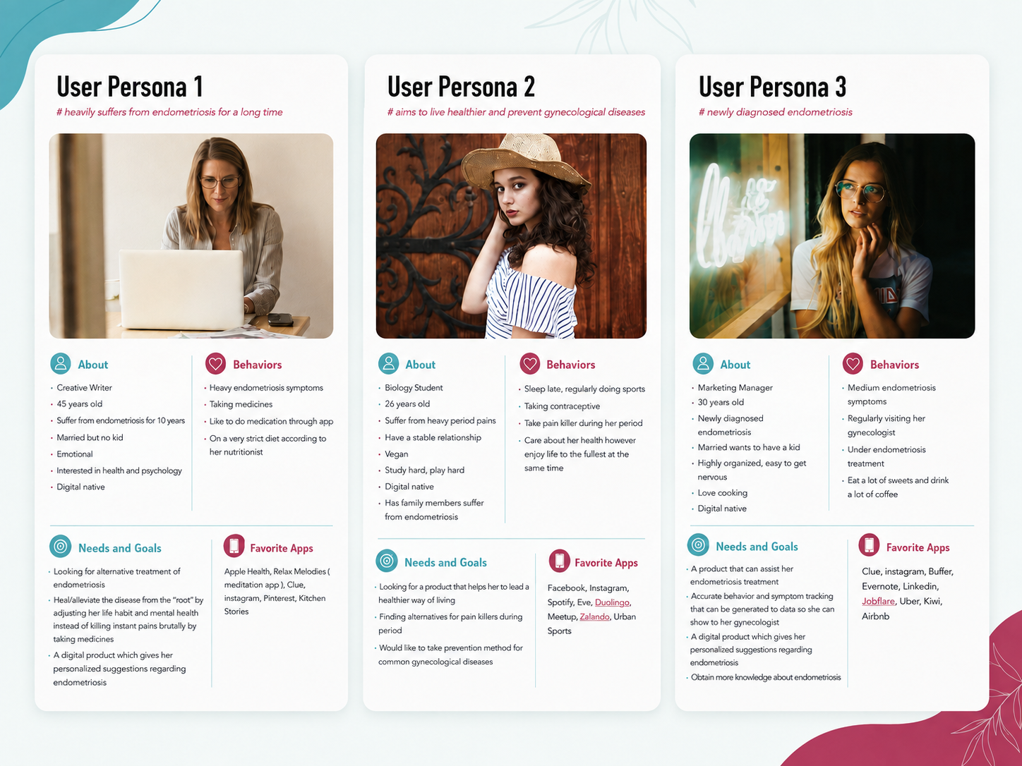
User personas
Based on the research, I created 3 main user personas to make the user’s context, behaviours, and goals tangible. We then used this persona to map the pains Inu needed to relieve and the outcomes the product should enable.
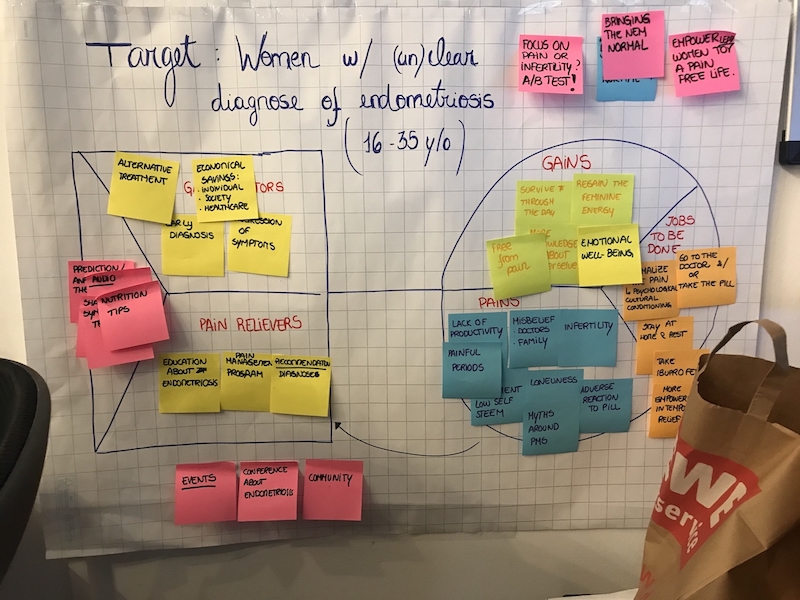
Turning research into a value proposition
We synthesised the research into a value proposition map, connecting users’ physical and emotional challenges with the outcomes they wanted to achieve. This helped us move beyond symptom tracking and frame Inu as a broader support experience combining education, self-management, therapy, nutrition, and community.
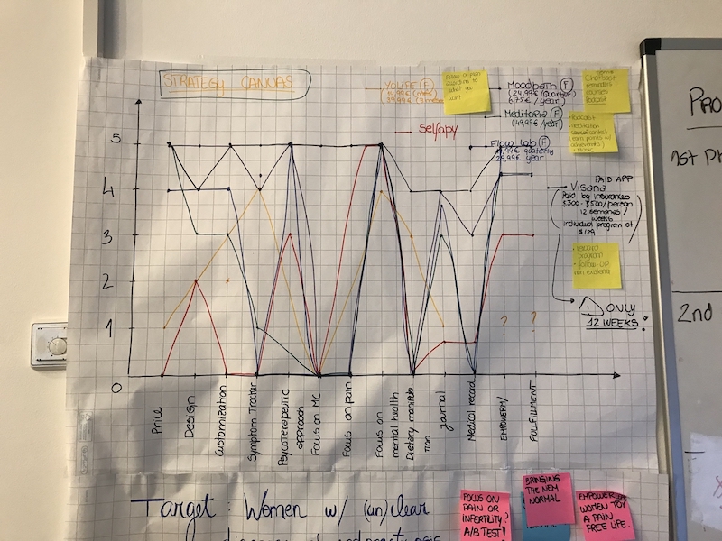
Understanding the market opportunity
Alongside user research, we mapped competing products across tracking, therapy, nutrition, personalisation, and endometriosis-specific support. This helped us identify an opportunity to connect symptom tracking with actionable therapeutic and lifestyle guidance, rather than offering another standalone period tracker.
Mapping the end-to-end experience
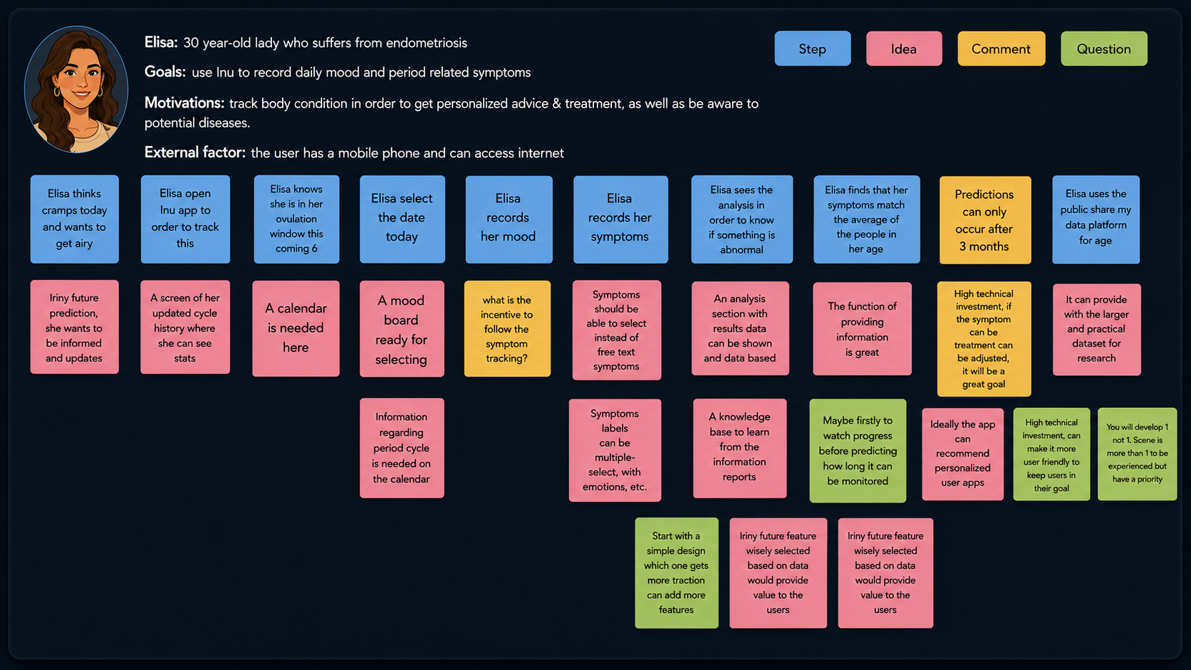
To translate our research and product strategy into a coherent experience, I mapped the user’s journey from recognising a symptom to recording it, reviewing patterns, and receiving relevant guidance. The exercise helped us identify moments of uncertainty, key information needs, and opportunities for personalisation.
DEFINE
From research insights to product principles
Rather than treating tracking, therapy, and nutrition as separate features, I structured the experience around a continuous support loop:
- Track — allow users to quickly document their cycle, symptoms, severity, and relevant daily context.
- Understand — translate recorded information into clear, accessible patterns rather than overwhelming users with raw data.
- Act — offer relevant therapy content, nutrition guidance, and educational resources based on the user’s current needs.
- Reflect — help users review changes over time and prepare more informed conversations with healthcare professionals.
This framework gave the team a clearer way to evaluate features and maintain a coherent product experience.
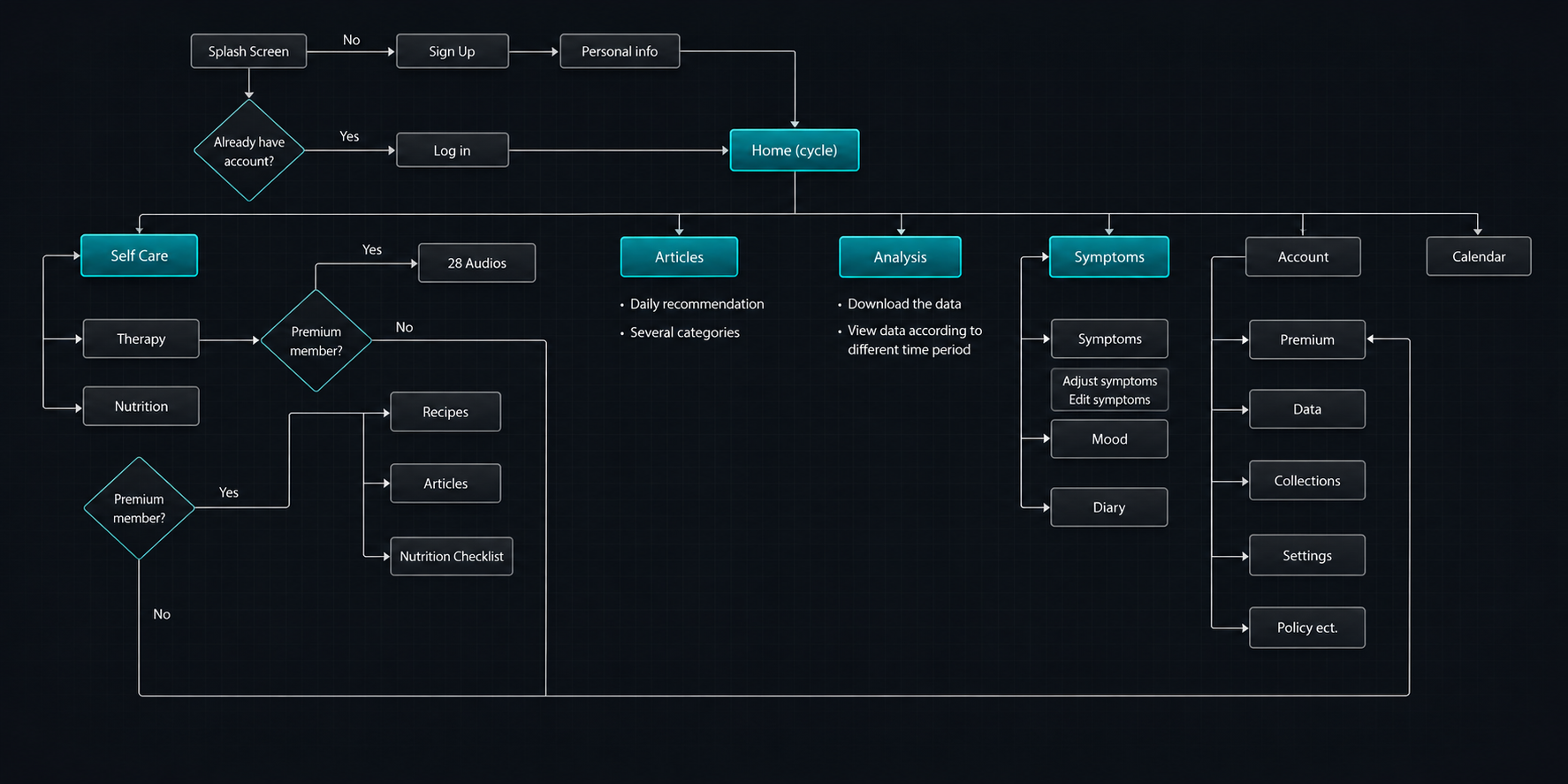
Defining the MVP
The initial vision included a broad set of health-management capabilities. To create a focused first release, I worked with the founders to prioritise the features that most directly supported the core user journey.
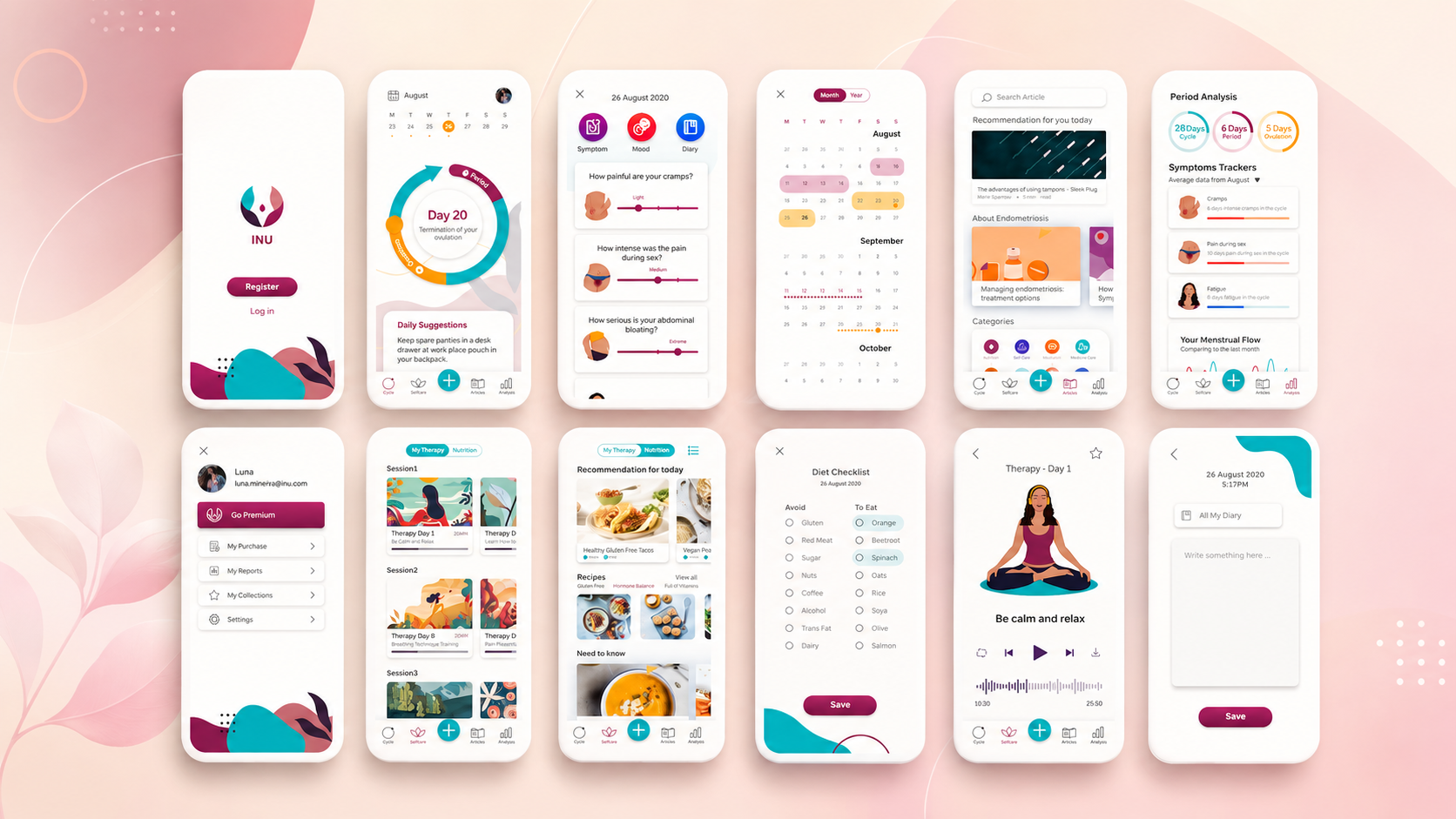
- Combined cycle and symptom tracker — a single place to record menstrual data and endometriosis-related symptoms.
- 28-day digital therapy programme — structured audio content designed to support daily symptom management.
- Personalised insights — simple analysis based on the information users record over time.
- Endometriosis-focused nutrition guidance — practical content supporting everyday food decisions.
The MVP deliberately focused on creating a useful connection between tracking and guidance rather than launching a large collection of disconnected features.
DESIGN
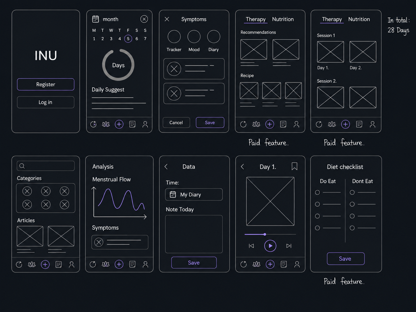
Designing the core experience
Onboarding and personalisation
The onboarding experience introduces the product’s purpose, sets appropriate expectations, and gathers enough information to personalise the experience without asking users to complete a long medical questionnaire upfront. The key design challenge was balancing personalisation with emotional and cognitive load. Users may enter the experience while in pain, worried, or fatigued, so questions needed to be short, clearly explained, and easy to skip where appropriate.
Symptom tracking
The tracker was designed around fast daily input rather than detailed clinical documentation. I prioritised:
- Clear symptom categories
- Simple severity controls
- Progressive disclosure for optional details
- Reusable previous entries
- A visual history of symptoms and cycle patterns
This reduced the effort required to track consistently while preserving enough detail to generate useful insights.
Personalised guidance
Instead of positioning analysis as a diagnosis, the experience presents patterns in cautious, supportive language. Each insight should answer:
- What has changed?
- Why might it matter?
- What can the user do next?
This makes the information more actionable while reducing the risk of users misinterpreting the product as a medical authority.
Digital therapy
The therapy programme was structured as a 28-day journey with short, manageable audio sessions. The experience was designed to:
- Make progress visible
- Keep daily commitments realistic
- Allow users to resume without penalty
- Connect relevant therapy content to tracked symptoms
- Reinforce progress without using overly gamified health language
BRAND & SYSTEM
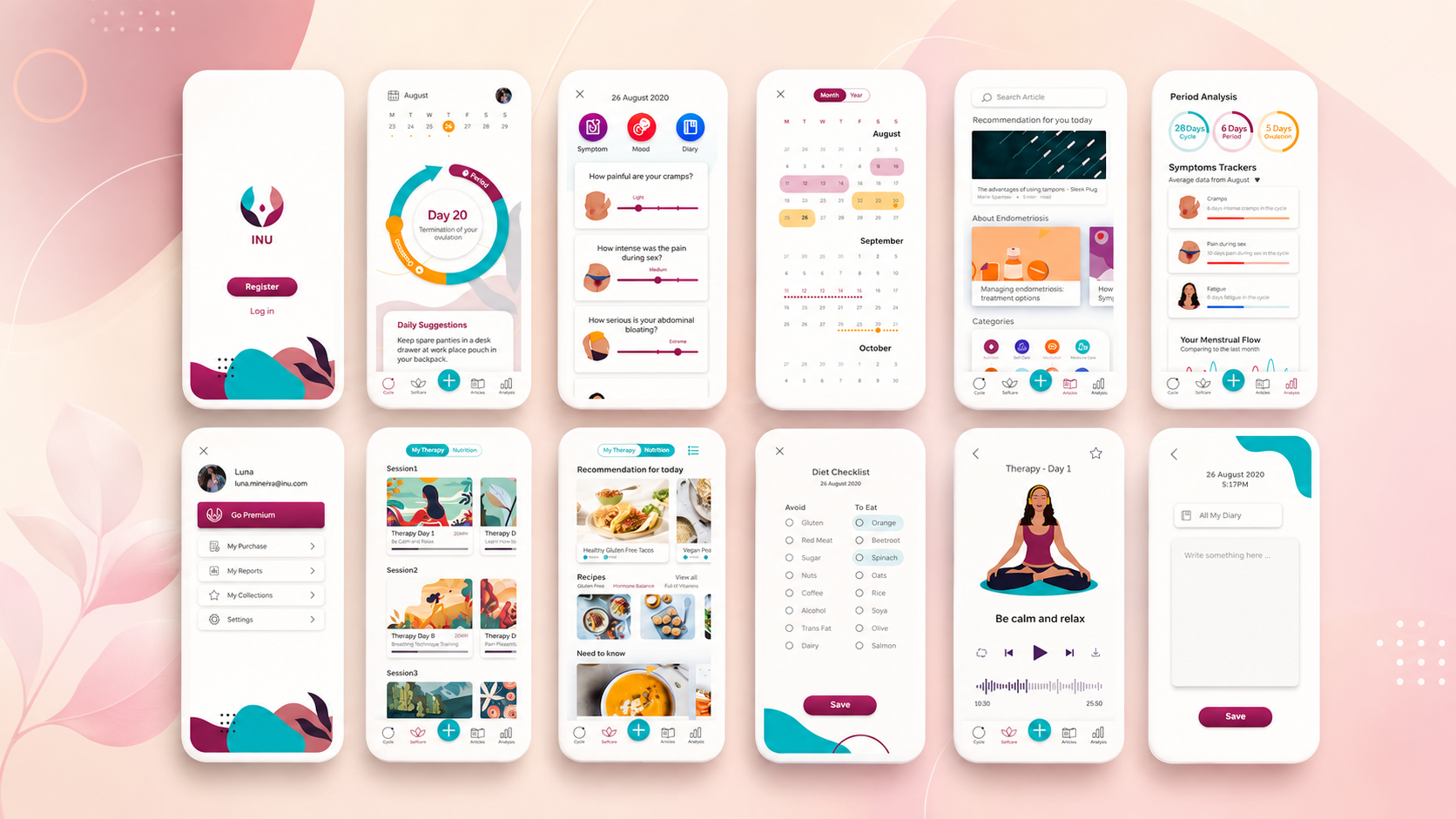
Building the visual language
I developed a visual identity that could work consistently across the application, website, illustrations, and social channels. The design direction aimed to feel:
- Supportive, not clinical — warm illustrations and approachable language reduce the emotional distance often associated with medical products.
- Credible, not intimidating — structured layouts and clear information hierarchy communicate trust without making the experience feel institutional.
- Calm, not passive — the interface uses restrained colour and focused calls to action while still helping users understand what to do next.
I also created a lightweight style guide covering colour, typography, illustrations, reusable UI patterns, and interaction states.

PROCESS
An iterative product process
One of my most important contributions was establishing a repeatable design and validation rhythm for the team. We worked in short cycles:
- 1. Define the highest-priority assumption
- 2. Design and prototype a focused solution
- 3. Test it with potential users
- 4. Analyse feedback through affinity mapping
- 5. Prioritise changes for the next iteration
The team alternated approximately one week of design work with one week of research and validation. This allowed us to challenge assumptions early and keep decisions closely connected to user feedback.
OUTCOME
Outcome
The project transformed an early-stage concept into a coherent product proposition with:
- A validated problem space
- Defined user groups and product principles
- A prioritised MVP with 4/5 user satisfactory rating (tested with 50 users).
- A consistent visual identity
- A repeatable research and iteration process
It also gave the founding team a clearer framework for discussing product priorities and evaluating future features.
REFLECTIONS
What I learned
1. Design health guidance as a relationship, not a dashboard. Users did not simply need more data. They needed help understanding what the data meant and what action they could reasonably take. 2. Emotional safety is part of usability. For sensitive health experiences, tone, pacing, and expectation-setting are as important as navigation and interaction design. 3. Early-stage design includes building the process. As the sole designer, my role extended beyond creating interfaces. I also had to establish how the team researched, prioritised, tested, and made decisions. 4. Focus creates a stronger MVP. Connecting a smaller number of features into one coherent support loop created more value than launching a broad but fragmented health platform.
Disciplines
- User Research
- Product Strategy
- Interaction Design
- Prototyping
- Visual Identity
- Illustration
Next project
Unitedtofu →